How House Prices have increased in Victoria?

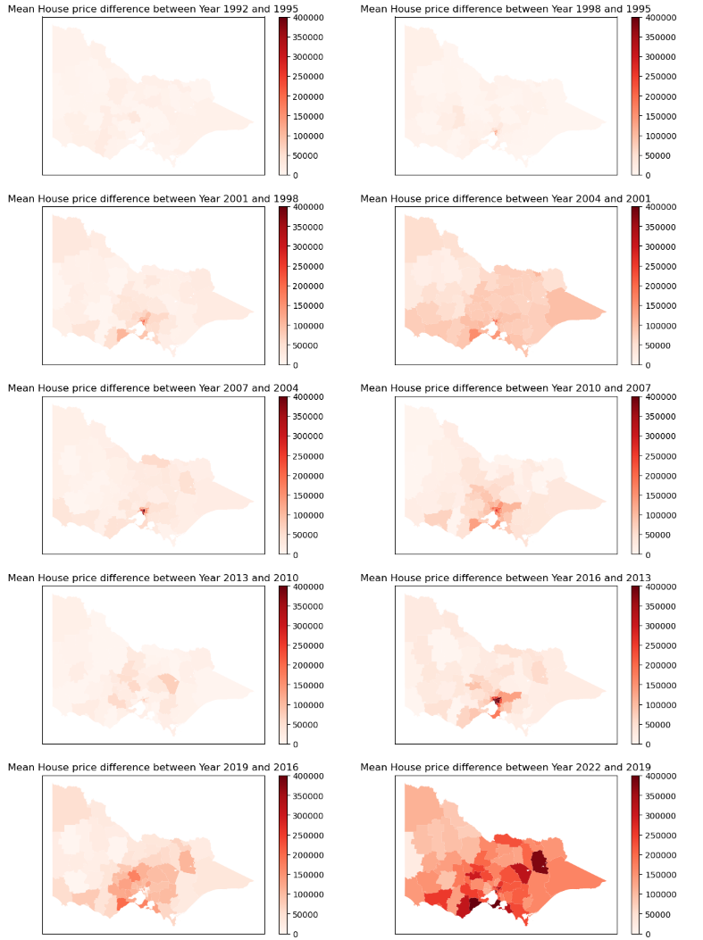
House prices have increased the most in Victoria from 2019 to 2022. All maps have been generated using Python.

Line chart titled 'Mean House prices of Local Government Areas over the years' showing the trend of house prices from 1995 to 2022. The y-axis represents house prices in billions, ranging from 0 to 1.6 million, and the x-axis shows years from 1995 to 2022.
Map of Australia showing local government area codes with color coding representing different regions.
Map showing data for Surf Coast region, with a popup displaying various statistics including total population of 154,388 in 2022, a density of 1050, and historical data from 1992 and 1999.
A series of nine maps showing the difference in mean house prices across a country between various years, with the color darker indicating higher differences.
Two maps showing the difference in average house prices over different years in various regions. The left map displays the price difference between 2019 and 2016, with darker red areas indicating higher increases. The right map shows the difference between 2022 and 2019, with darker red and black areas indicating the highest increases.
Map of Texas showing various counties shaded in different shades of red, with a color scale bar indicating perc_diffmost values at the top.
Map showing demographic data for the Mornington Peninsula, with highlighted regions and a pop-up with statistics including diffmost, year 1992, 2022, and percentage diff.
Map of Maribyrnong, showing data related to demographic change over time, including population figures from 1992 and 2022, with color shading indicating levels of change.